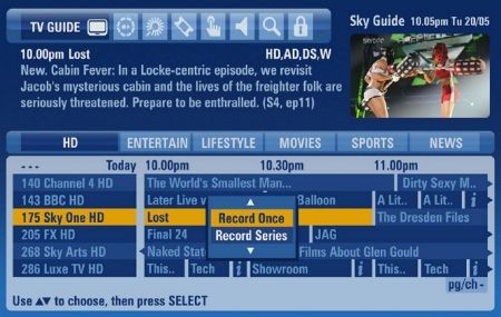
Sky+ HD users will soon be noticing some changes when they press the “TV Guide” button. Sky will shortly be updating the look and feel of the on-screen programme guide. Here’s a preview:

Sky+ HD boxes made by Thomson will be the first to get the new guide, which includes a mini-TV view (so you can watch TV while browsing the guide), improved search, easier series link access, and a tabbed categories navigation.
The rollout of the new guide should be starting next week, and may take “a few months” to get to all Sky+ HD boxes.
hi i hate the new guide,people ive talked to agree.you have no button to skip to next page,you have to scroll down,its very time consuming.the letter sizes are smaller.its crap.why change it was a much user freindly winning formula.
Just press channel up or down for the next page you muppet
I HATE IT!!!
but i like pie.
i cant the new look sky im in belfast
It is a poor attempt to make us buy the Sky services – putting them in your face and making the very expensive usual services harder to use.